berenice abbott
|
|
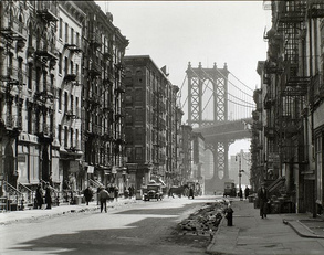
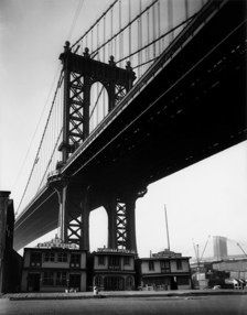
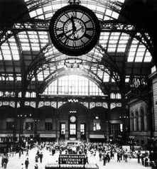
I really like the images by Berenice Abbott, it might be for many different reasons. To begin with I like how all of the images are from New York- a city with amazing architecture, I also like how all of the images are monochrome as in my opinion it makes you look more at the detail and the intricate designs of the buildings. The two images on the left are of the Manhattan Bridge, I like these images as they emphasise the size of the bridge and show it in the best way. The second image at the top is of Grand Central Terminal, it is a beautiful place however it has changed a lot since this image was taken by Berenice Abbott.
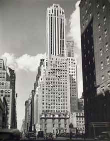
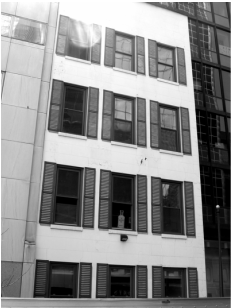
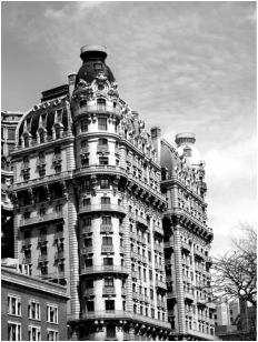
The fourth image is also a very good photo, I like how the building is offset to the right so it seems like the building isn't the main focus of the image, I also like how there are lots of different shades of grey. |
|
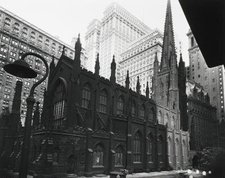
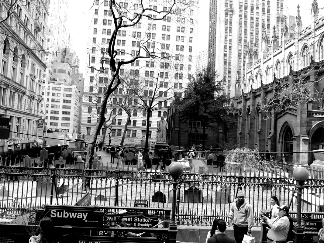
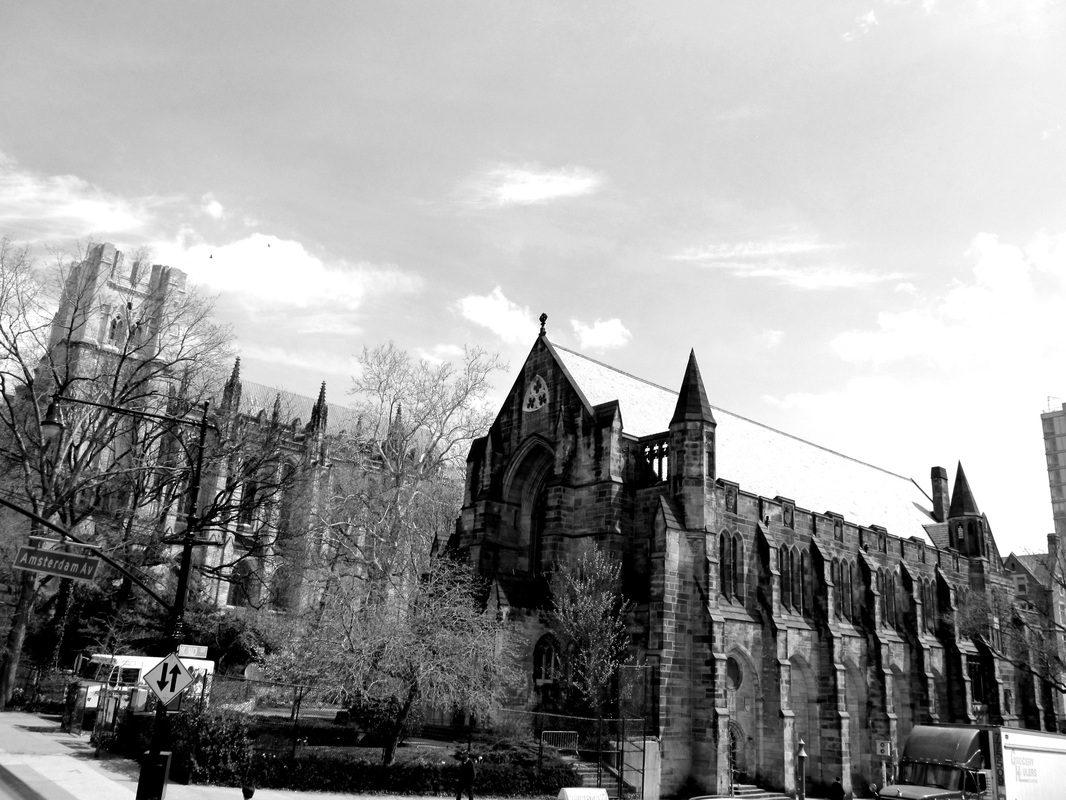
The image to the left seems to be of a chapel, I like this photograph as well as I like the different shades of grey as it seems to give the image more depth as each colour seems like a different layer. I also like how there are multiple different angles shown by the edges of the buildings, lamp posts etc.
|
my response
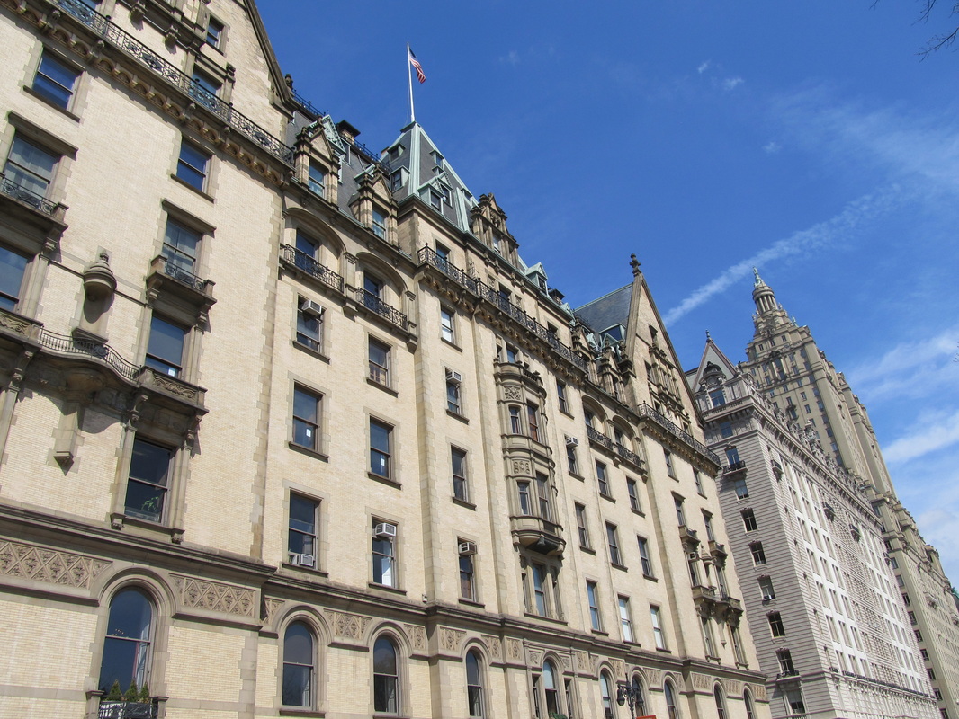
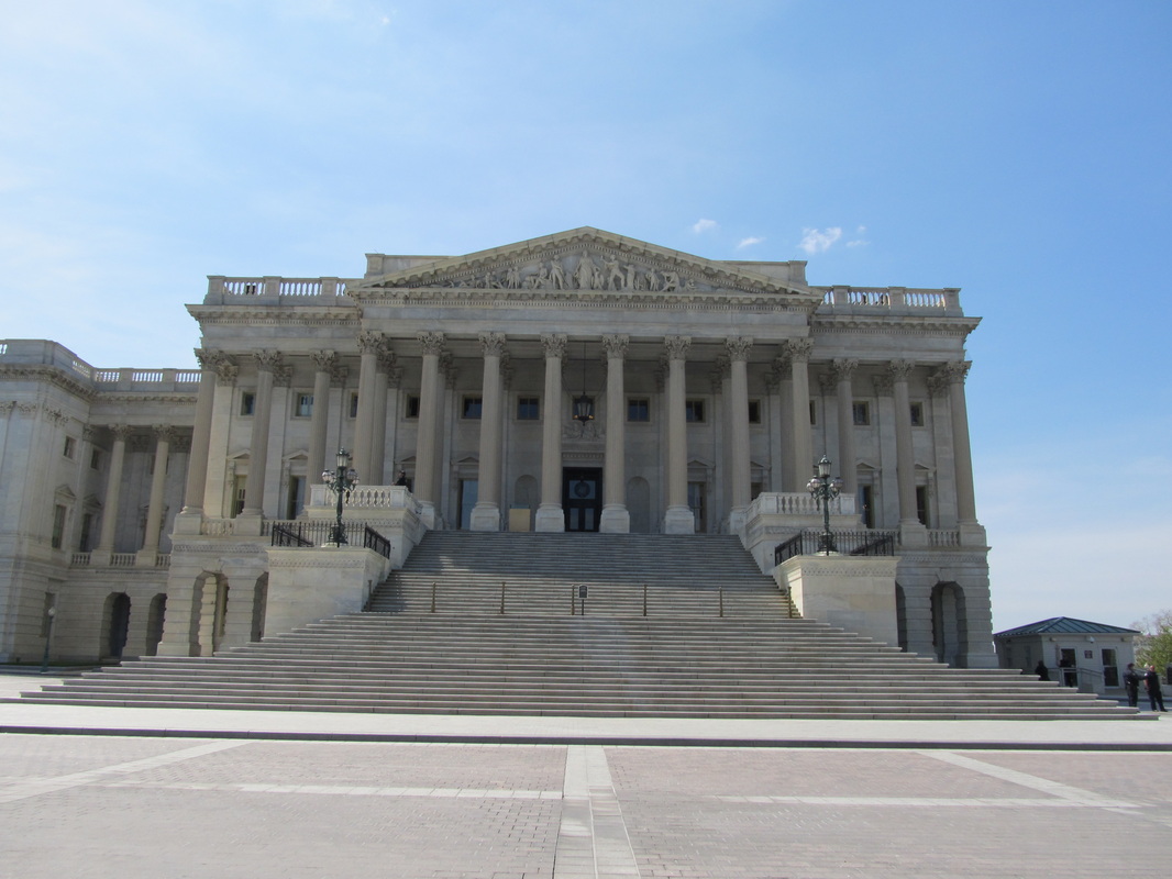
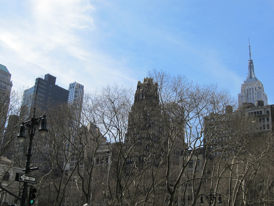
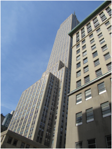
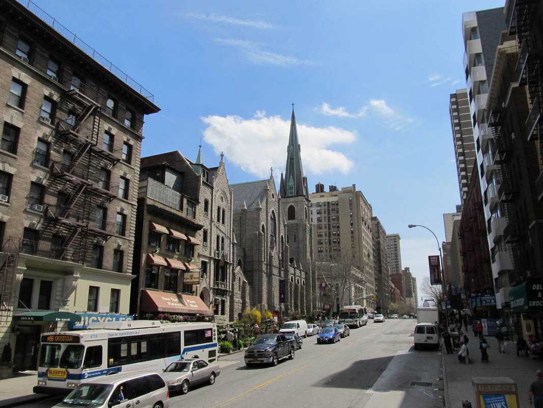
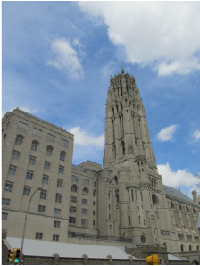
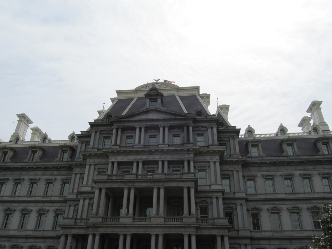
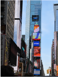
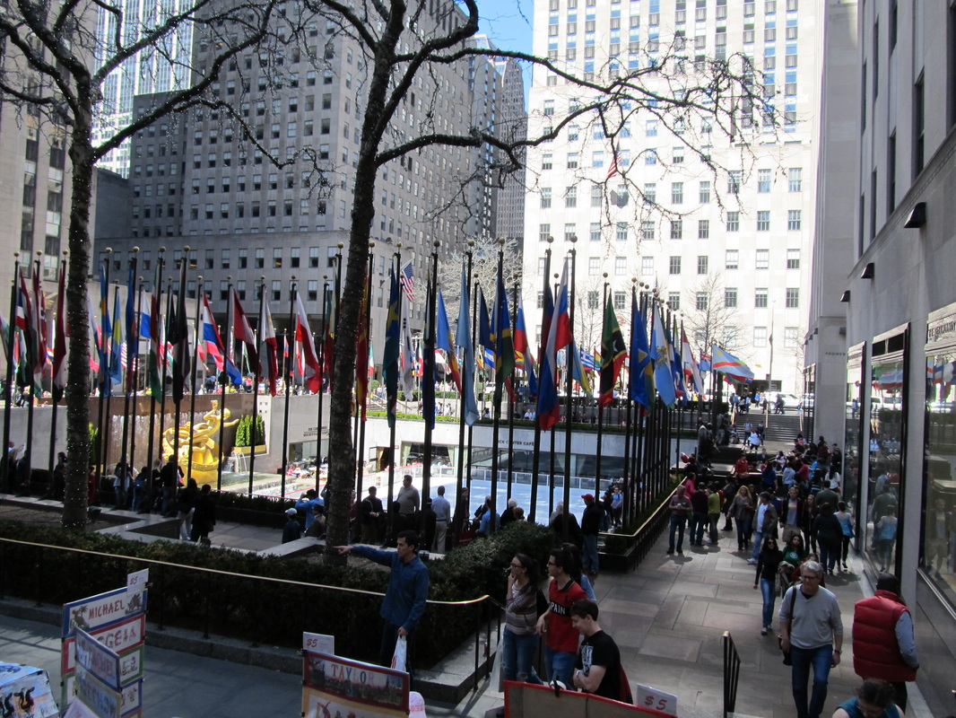
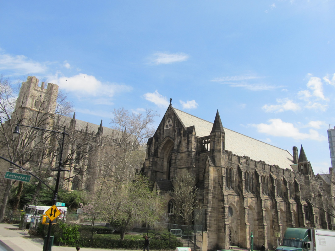
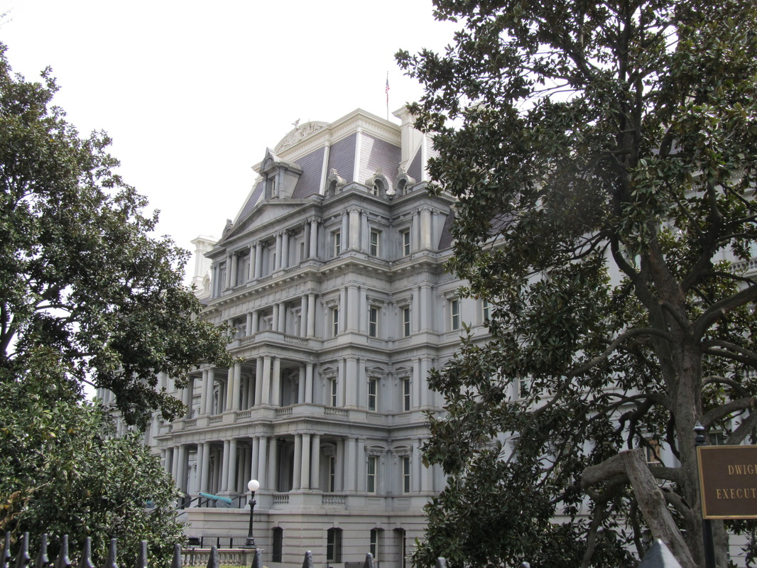
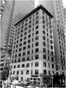
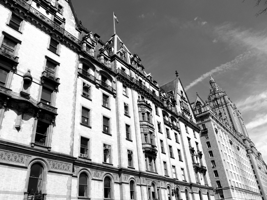
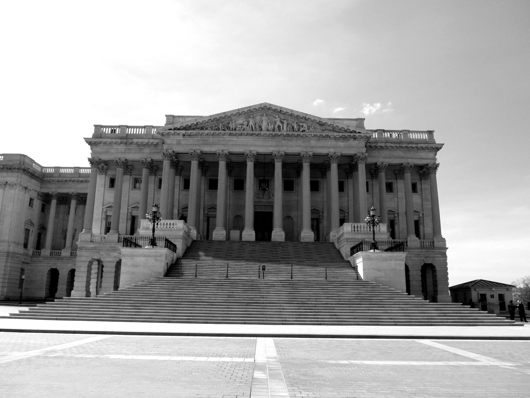
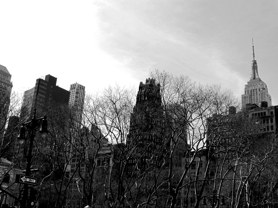
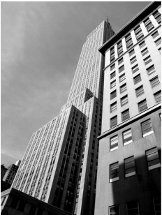
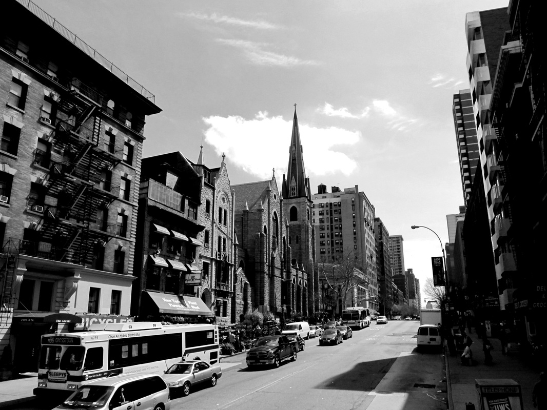
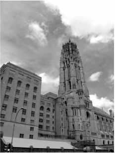
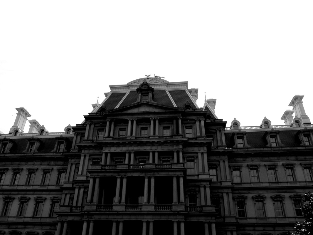
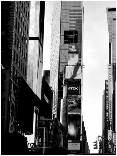
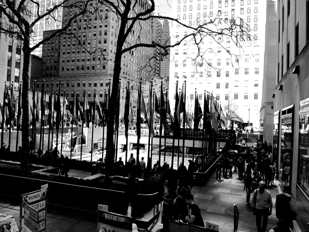
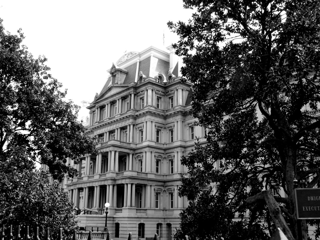
Some of my images in the response below are of pictures I have already previously taken however when I researched Berenice Abbott it made me think of the pictures I had took already. These images are from when I went to New York and Washington, these copies are all in colour, however my edited response below these images are in black and white.
|
|
|
edited photos
|
|
|
I quite like my images and once they were put in black and white they really did look in the style of Berenice Abbott. I like how the images I took are in the same area as she took hers but she took hers in 1935 to 1938 whilst mine were taken in 2014. I think these images all show that they were taken recently as somehow I think they look modern- even the old buildings.
